Visual Interface Designer
Snapchat (via Aquent Studios)
instant messaging camera app
Nov .21 — April .22
Duration: 6 months
San Francisco, CA
Tools: Figma, JIRA, Zero Height
Team: Accessibility Engineers,
System Design Lead
Snapchat Interface Guidelines
Snap Interface Guidelines (SIG) is an adaptable system of tools, guides, plug-ins, and components that support the best practices of user interface design. Backed by code, SIG streamlines collaboration between designers and developers, all while helping teams build innovative products.
Dynamic Type (using iOS terminology) is an accessibility feature implemented in SIG components. It is used to create impact on accessibility and localization. While a sizeable percentage of Snap’s customers are using a larger font size setting, it is important to migitate the strain to read.
The more people can read, the less they have to strain to do so,
the more engaged they can be.
Opportunity
The ultimate goal is to complete support for this technology across the Snapchat app on Android and iOS.
The #sig-team needs to ensure a friction-free process for designers and developers yp update their surfaces, refractor code, and incorporate these practices in new work moving forward
Current Functionalities
Overview screen: Snap’s messaging vertical did not support Dynamic Type ramps. Type will stick to the default SIG text styles, which can be an issue to older audiences. According to data, 43% Android users and 27% iOS users >35 years use larger type ramps.
As part of this support, existing SIG Typography styles will be updated to a new set of styles that account for Dynamic Type.

From left to right: (messaging screen, create group screen, conversation screen)
How does Dynamic Type look like for users?
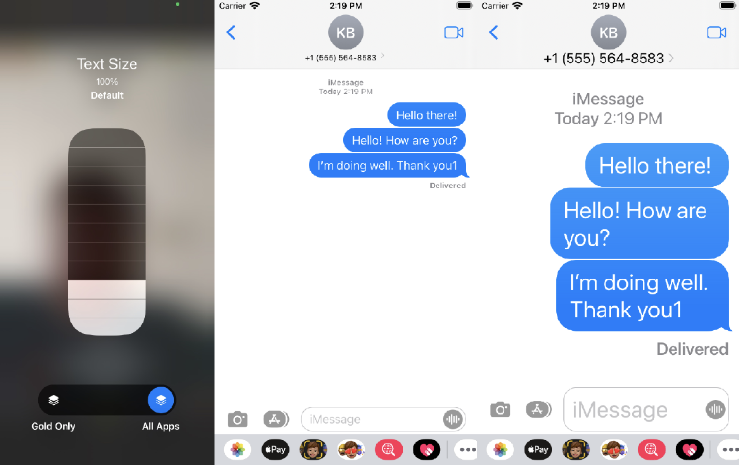
iOS Type Ramps
Apple provides a list of “styles”, one of which must be set when building in dynamic support. This is not like SIG Typography Styles. There is no “size” related to each typographic style. Apple’s styles are meant to (as close as possible) describe the context of usage. When creating a font for a specific place in the UI, the developer needs to define both the Apple style and the default size it should be made at.
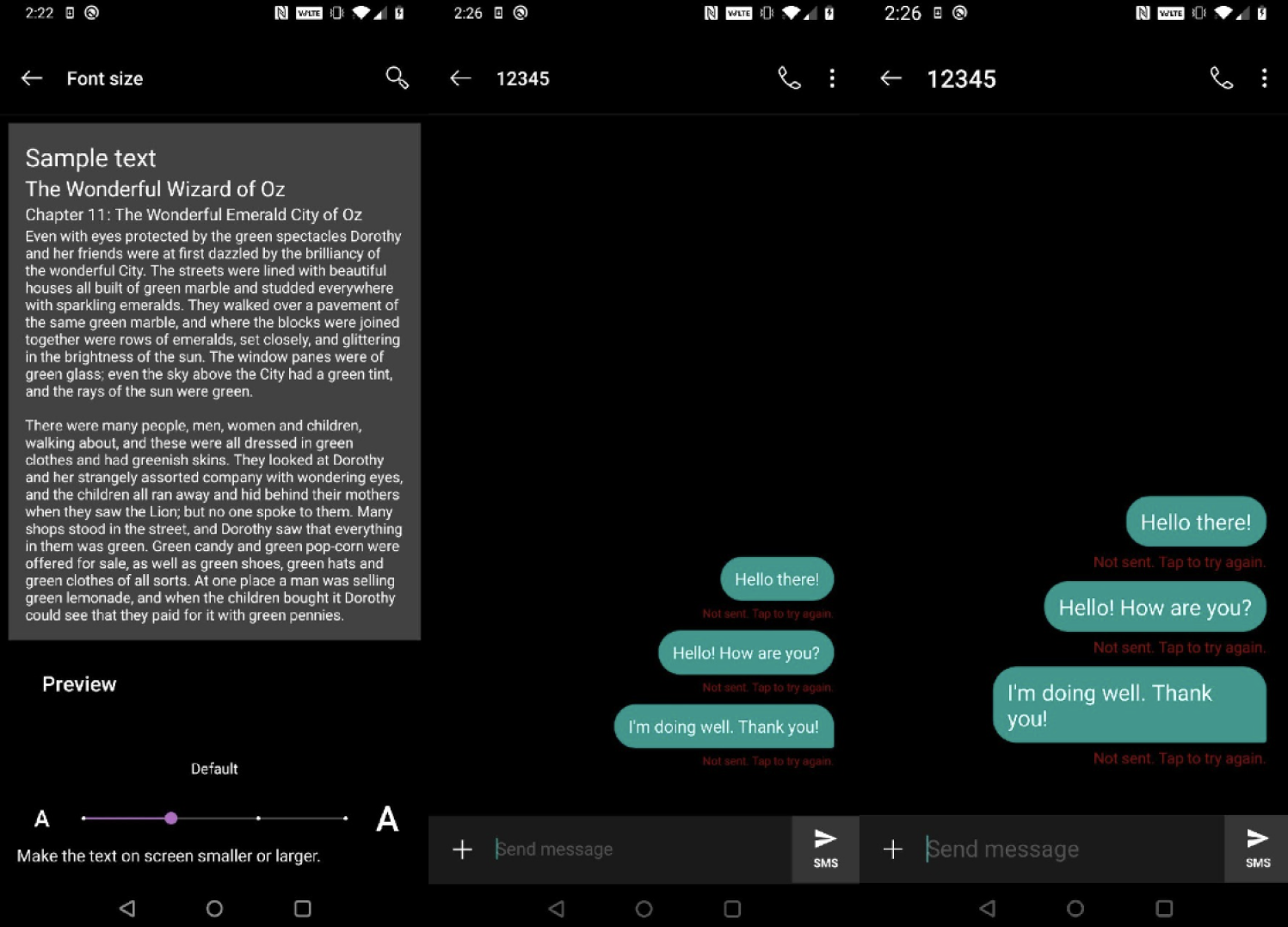
Android Ramps
Android font scaling works across all text globally by providing a dimension in scalable pixels (sp). This dimension scales with the user’s font setting, as well as being pixel-density dependent. Note this dimension can be used anywhere size is required allowing for margins, button sizes, etc, that scale with the user’s font setting.
Impact on Snap’s XFN developer teams
Mobile development teams at Snap should be able to choose when to opt their surfaces in to support for the user’s Dynamic Type setting. They will not need to worry about the setting being inconsistently applied to a portion of the screens they are responsible for. This aligns user’s interests with the teams, since whole-screen and/or user flows can be considered holistically to ensure an entire experience is accessible.
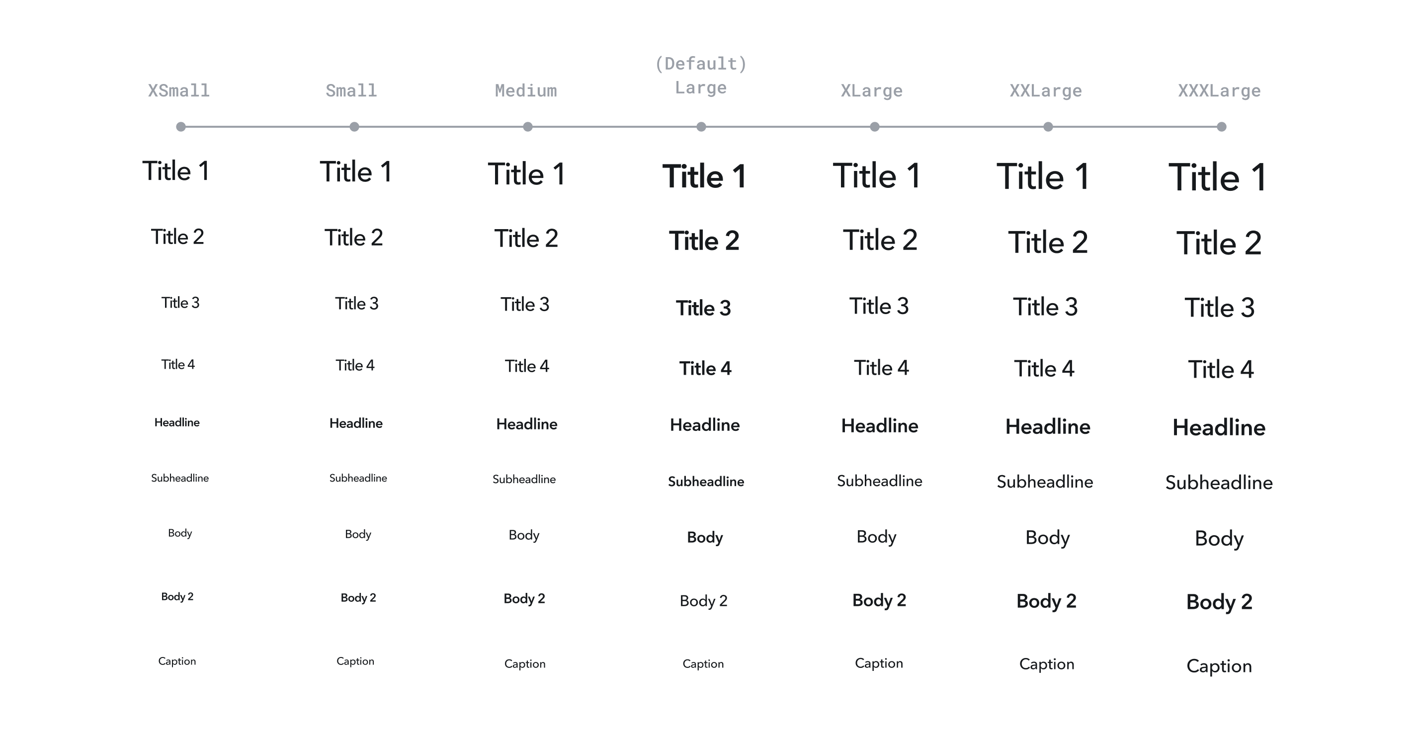
Updating SIG Typography
As part of this support, existing SIG Typography styles will be updated to a new set of styles that account for DT (Dynamic Type).
Current Issues:
● Too many text styles (24 styles in SIG)
● Tracking is too high
● Inconsistent size and weight
When too many styles are used in a single screen, it can appear
crowded and feel cumbersome. New style pairings are designed to be proportional and easy to read at a glance. The new styles text size
and line height adhere to multiples of 4 which aligns with the 4dp/px baseline grid.
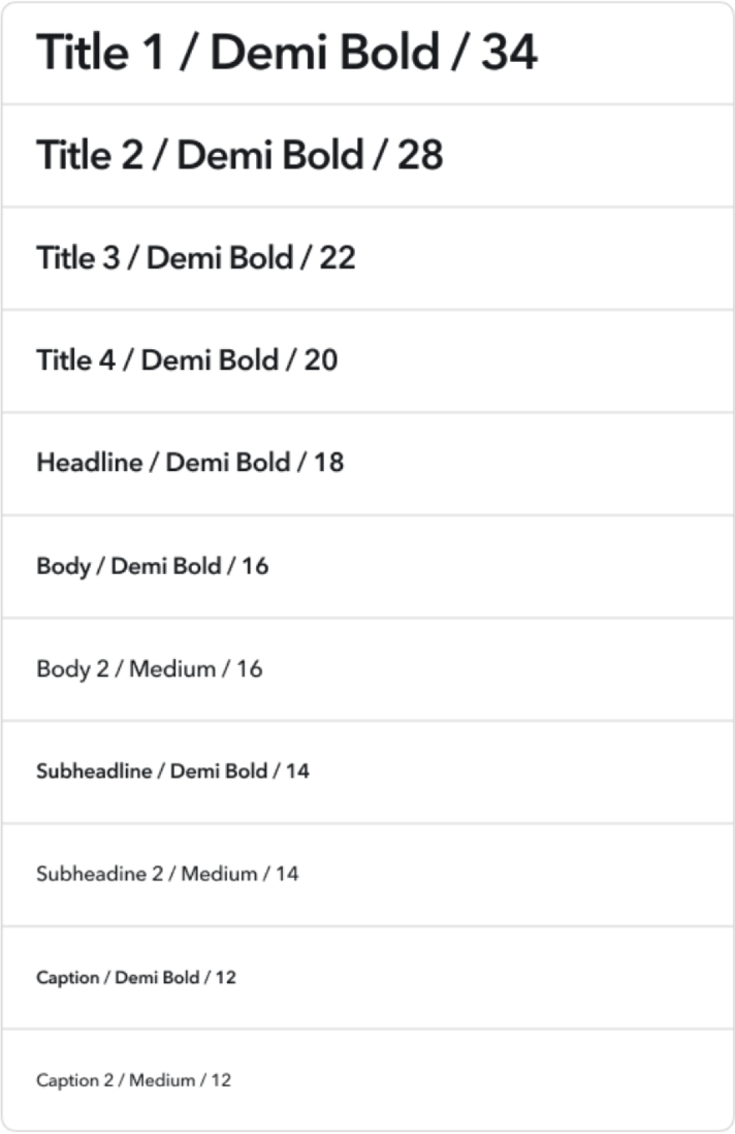
Existent types in SIG
Implementation
SIG Type: custom scale (iOS)
When creating a font for a specific place in the UI, the developer needs to define both the Apple style and the default size it should be made at.
1. SIGTitle (20pt)
2. SIGSubtitle (18pt)
3. SIGBody (14pt)
4. SIGCaption (12pt)
Choosing “SIGBody” will default to 14, and then “ramp” up and down based on Apple’s formula when going smaller, larger, and much larger for Accessibility. A “title” will not see the same proportional changes as “body” over the full range from smallest to largest.
On iOS, opting in to support per “view controller”. A view controller on iOS is usually implemented as a UI for a particular context. There are many examples, but it can usually be thought of as a particular screen or modal presented by another view controller.
SIG Type: percentage based scale (Android)

val textView = SnapFontTextView(context)
textView.textSize = "14sp"
The difference between this and iOS is that the usage is context-less - it doesn’t matter if it is Body, Headline, or Title, 14sp will look the same anywhere it is used.
Note that the scaling factor can be different across device models/manufacturers. On one device, “larger” text size can mean 2x scaling while another device can be 1.5x.
Production
Spec creation for engineering handoff
Using both percentage & custom based scale, I focused on all of Snap’s SIG components’ dynamic reaction to type ramps. When I started working on each component’s redlines, I applied the iOS developers’ percentage based principles.
Producing redlines for SIGXCell
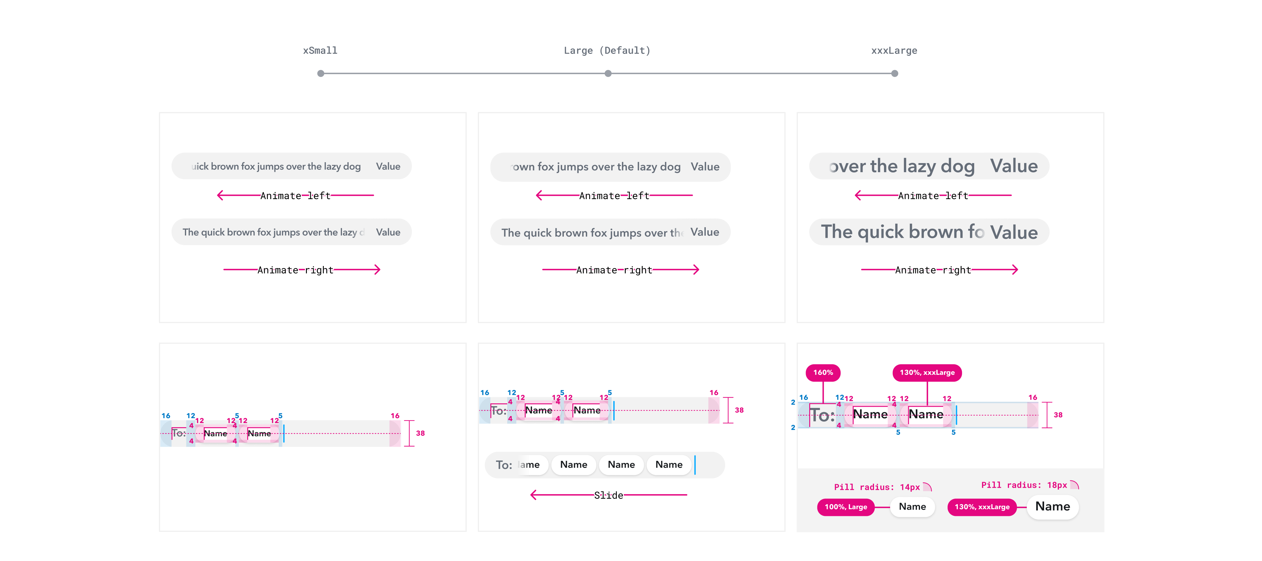
SIGXCells are a vertical presentation of data, which can include text, images, and/or controls.
In this demonstration, we are focusing on SIGXCell User + Select, which are most commonly found in Snap’s messaging & friending screen screen. Before implementing Dynamic Type ramps, I created redlines to study the component’s anatomy.

Dynamic Type ramps
There are three type ramps in the production spec: xsmall (85%), large (default), and xxxlarge (130%). I wanted to display layout strategies that prevent type to truncate on all label forms, while performing similar actionable functions across all type scales. I did multiple rounds of brainstorming sessions with the developers during SIG standup.

Ideation: layout & cell compression

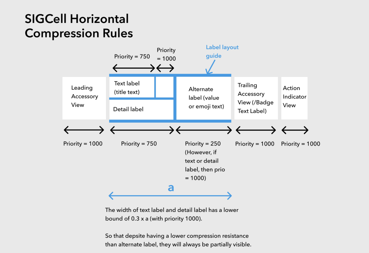
Implementation
Changes: Text can now grow with the user’s setting. Layout will have slight influence we cells grow.

UI playground
With every component implementation, comes with component quality check. Designers and engineers test on a UI playground called “SIG Controls catalog” that helps to test component functionality & dynamic type behavior.

Tenets
1. We want to provide developers as much platform support as possible to make it easy and likely for Dynamic Type support to be implemented.
2. We want to minimize redundancy or retreading over the same UI. This will likely be seen as undesirable and unexpected work to land on teams, especially if a migration changes existing UI.
3. Minimize the amount of work that requires P0 or launch-blocking attention. Incentivize opting-in so teams can develop at their own pace to the benefit of app quality.
4. We want whole user flows (end to end experiences) to be dynamic.
Takeaways
You can always iterate on dynamic type
SIG components implement differently from spec to migration. This is where the collaboration between system designers and developers highlights different highlights. Therefore, it is important for designers to define solutions with greater complex.
Android, iOS, and Composer type ramps are difficult to align
While it is easy to toggle layout strategies, all platforms have different type ramp logic. As a result, complications create staggered deadlines for Android compared to iOS and Composer.
 Ting Chang ©️ 2023 | Last updated: March 2023