Visual Designer, Design Systems
Roofstock
real estate investment marketplace
March .21 — October .21
Duration: 8 months
Sacramento, CA
Tools: Figma, JIRA
Team: Product Design Lead, Brand, Engineers
The need for brand repositioning
Roofstock is building the world's leading real estate investment marketplace. Their mission is to make ownership of investment real estate radically accessible, cost-effective and simple. To solve the problem, they are building a leading tech-enabled real estate investment marketplace. I joined Roofstock when they needed a Visual Designer to redefine their brand positioning. Although the product has a high impact, the company lacked a scalable design system and style guide to support it. This created many blockers, not only for the brand team, but for developers who struggle to build components with little to no resources.
I took the initiative to align the brand between marketing & product, to instill collaboration between XFN teams.
Opportunity
When I joined the team, the developers and product designers already had a close-knit relationship. Their daily sync include performing audits for existing components while using Material Design principles for the MVP web product. Unfortunately, these components were outdated, pinned to an old style guide that fails WCAG guidelines. Marketing team works mutually exclusive with the product team, which means that there is no brand alignment between the two teams. Without any guidance or ownership, it created divergences within projects from the brand foundation and component libraries. Nothing that was built matched eye-to-eye, which is a huge problem if Roofstock wanted their users to trust their product.
Impact
It was crucial for me to lead Roofstock’s first phase of the design system refresh. I began by formalizing the practice and culture of systems, documentation, brand style creation, and scaleable design thinking in my product design team. This comes in many benefits such as:
● Increased collaboration: Introduced new color and typography that works for both product and marketing teams has significantly changed the way these XFN interact with each other.
● Stronger brand foundation: Introduced the core brand personality that makes up Roofstock. This has significantly aligned XFN teams, as well created a clear direction on designing incoming assets and updating foundations.
● Scalable style guide: Informed XFN teams about component changes & updates has added value of investing in an extensive style guide.
● Efficient design deliveries: Built foundations accelerated designers’ and marketers’ workflow.
For Roofstock, our brand is about how our investors connect with us on multiple levels, through different brand touchpoints.
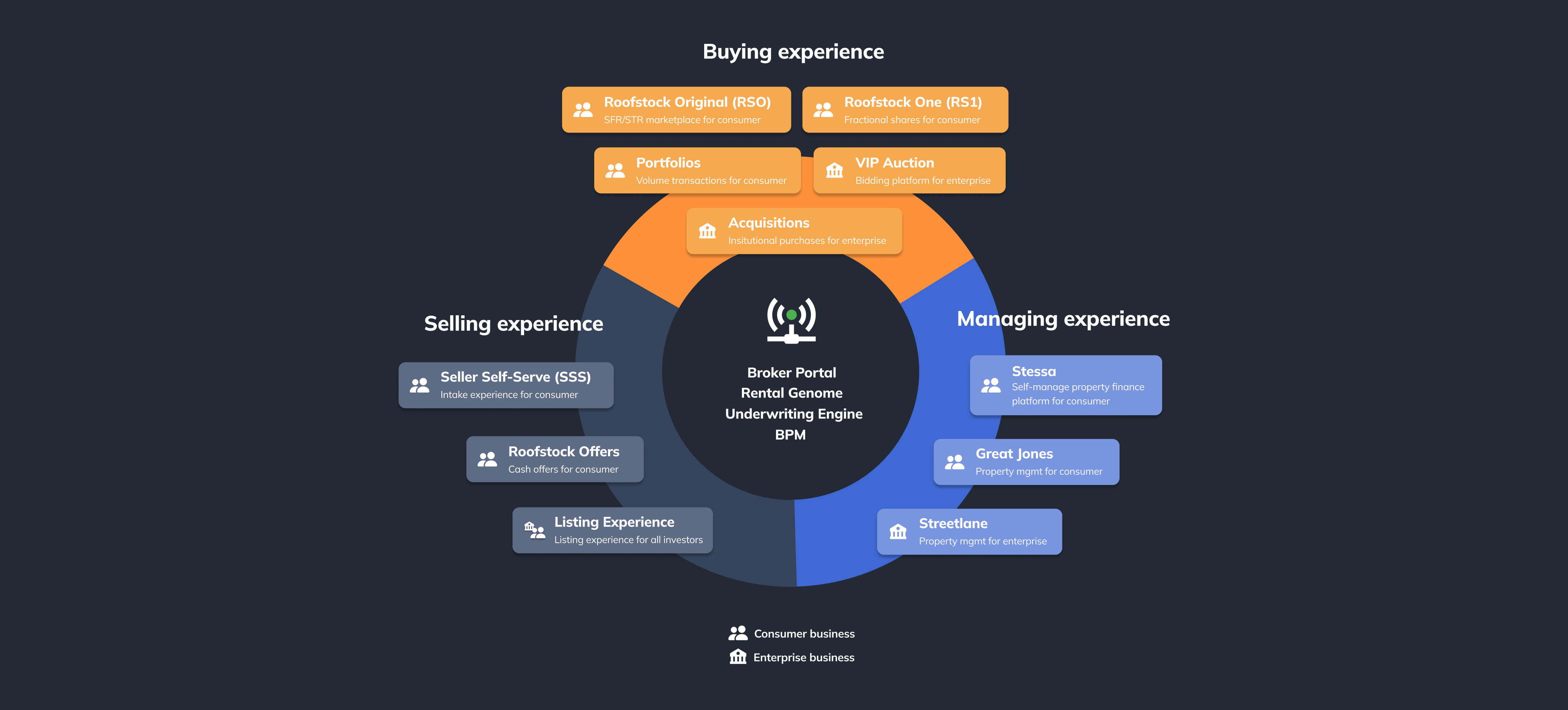
Product Ecosystem
Multiple products available for different user needs
Before jumping into the brand refresh, it was important for me to understand Roofstock’s product ecosystem. Some products on the management experience (i.e. Stessa, Great Jones, & Streetlane) were acquired by Roofstock. These products had a design system specific to their brand that I cannot alter.
Building collaboration
My initial focus was to study Roofstock and RS1’s Buy-and-Sell experience, prior to diving into color and type study. My contributions to the design system started by understanding the voice & tone, and leading the style guide refresh.
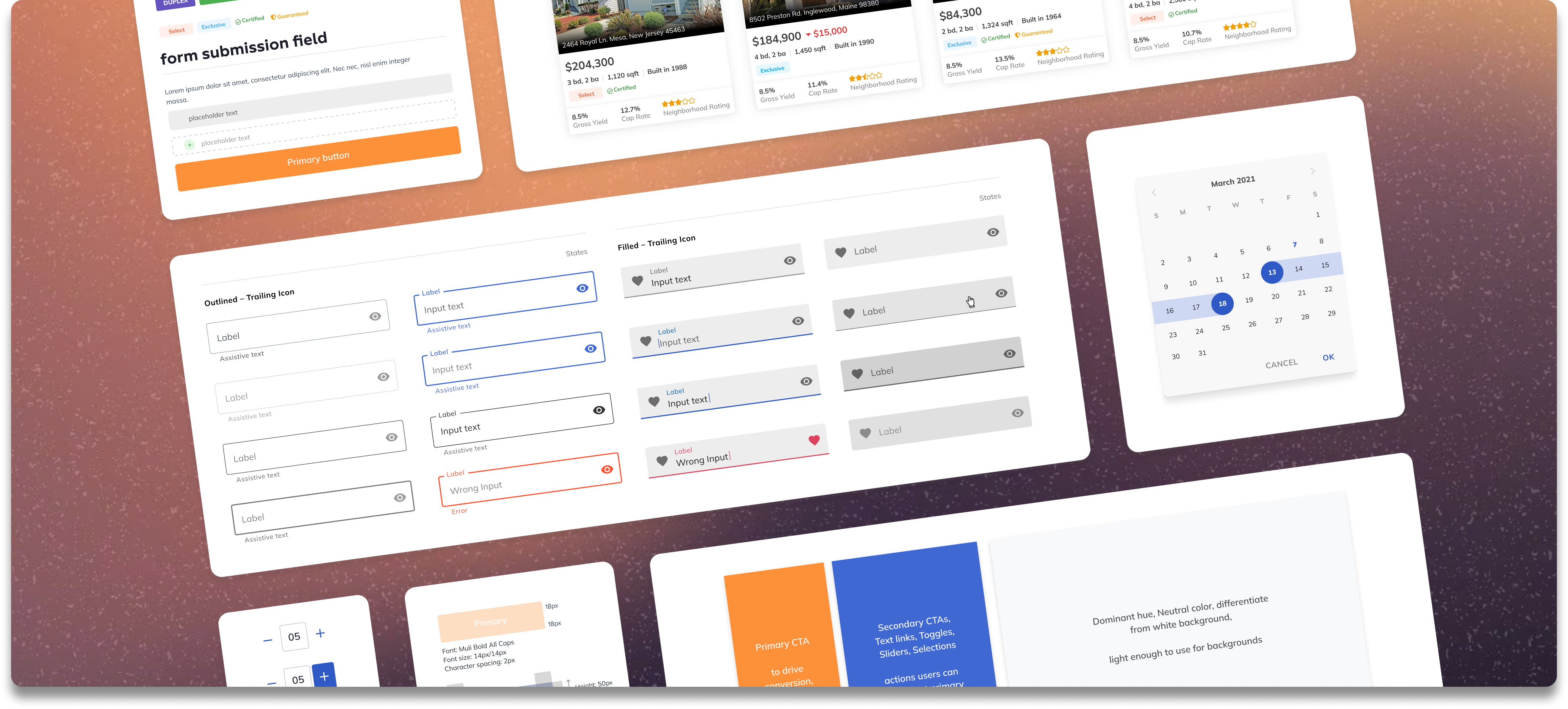
Roofstock’s old design system and files were previously living in Sketch. One of our largest projects involved conducting audits for each of the platform’s existing components, migrating reusable components, and deprecating non-workable components.
The migration involved me and the product design lead, using this opportunity to improve the foundation and component system from the ground up. In addition, it allowed me to identify pattern updates with type scales and color accessibility, which insured that the updates always led back to a source of truth.

Design libraries
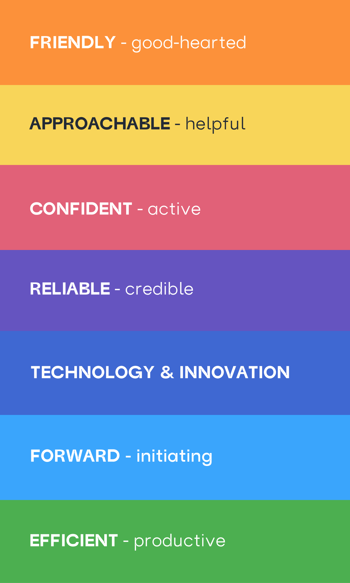
There are seven pillars of Roofstock’s brand personality that makes up the company’s core values. These were finalized after conduction of a brand health survey across the company.
Goal: The goal of this guideline is to create a visual language that synthesizes classic principles of good design, and to create a unified experience across our user interface and branding.
Our Users: We must be thoughtful in our design decisions and respect what a user needs with every decision that we make. We should strive to understand what we are asking our users to do and the impact it will have on them. Every time a user interacts with our product, they should receive a personal value from it.
The Consistency: The following guidelines are put in place to create a cohesive identity and brand foundation that best represent Roofstock in an authentic and engaging way to people. With a consistent design system, we can focus on being ourselves, true to our core purpose.
The Brand Personality: Our personality is a product of our mission and a reflection of our culture, values, and promise to our users. It establishes the foundation of the Roofstock brand. We should strive to make our personality come through in everything that we design.
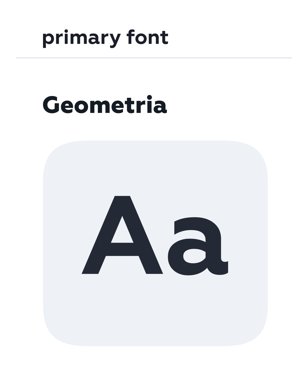
Roofstock’s type scales
I introduced Roofstock’s custom fonts, Geometria and Mulish, for almost everything brand and marketing—from banner ads to billboards. It was designed to be incredibly versatile, with lots of range in terms of tone and playfulness. It can be quirky and expressive when it needs to be, or neutral when the situation calls for something a bit more serious.

After establishing Roofstock’s primary and secondary font, I used the 1.250 Major Third rule in relation to Tim Brown’s Modular Scale to create type scaled on both the landing pages & product web and mobile MVP.
Medium scales (1.15–1.333) have a clear hierarchy, and help to organize sections with subheadings. A medium scale is versatile and works well for a wide variety of desktop sites, including blogs and marketing sites. This has increased legibility across all XFN products, all while using the same type.

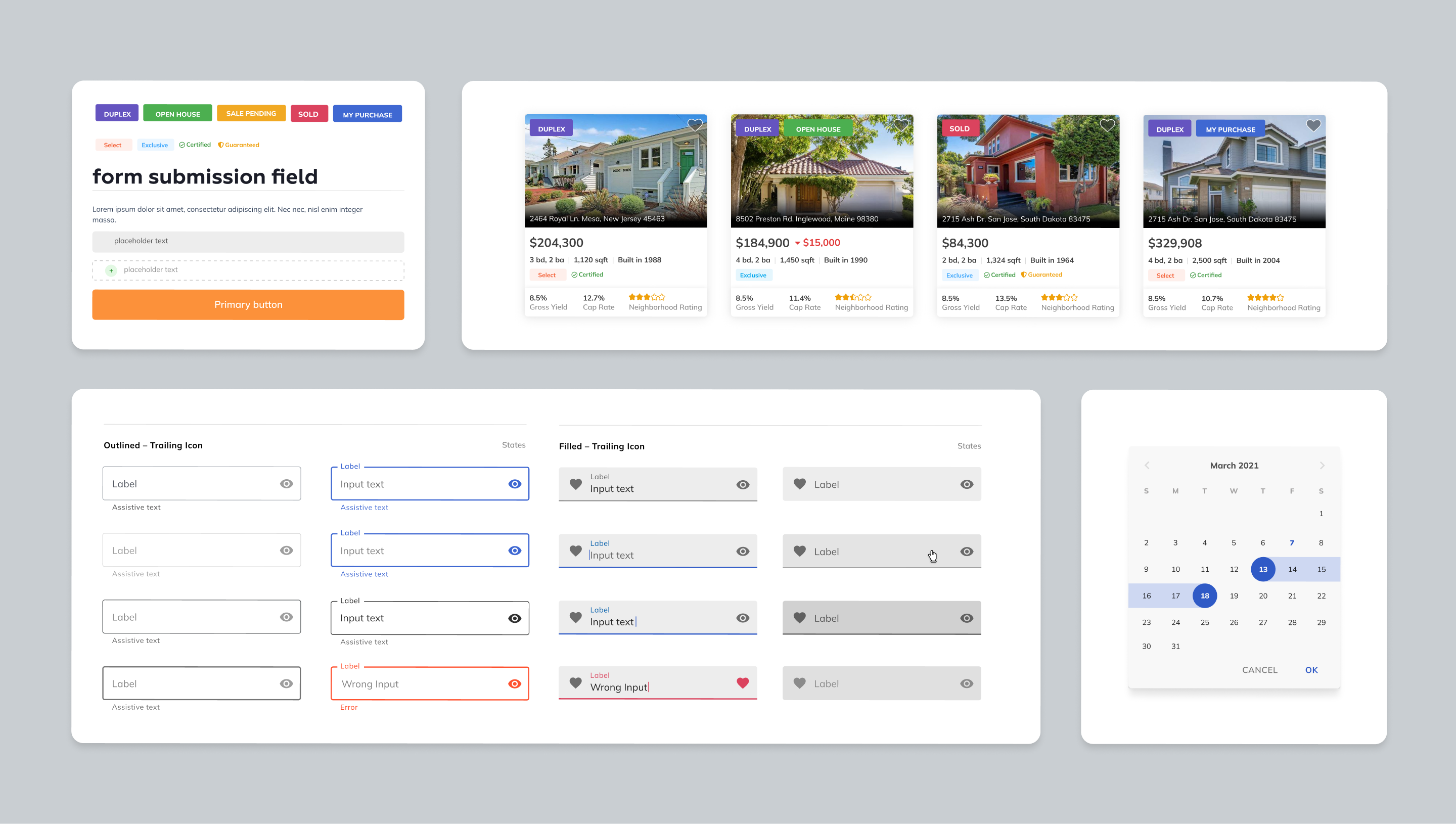
Marketing color system
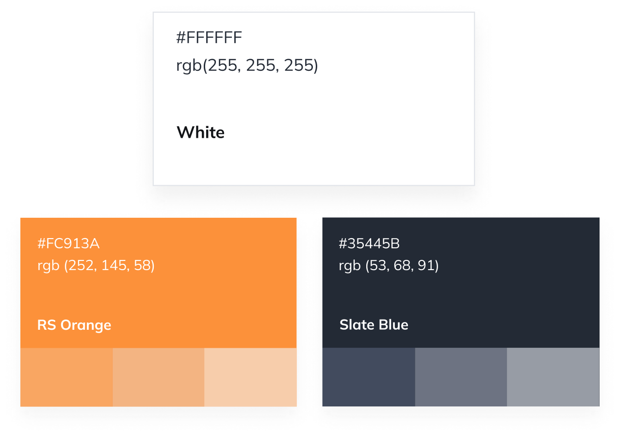
Color distinguishes Roofstock’s brand and creates consistent experiences across products. The primary palette comprises Roofstock Orange (to bring boldness to the brand) and Slate (neutral), and white to tone our vibrant brand color. It is also used in logical ways through the marketing and product channels. This is to help guide the users’ eye and highlight the important bits. Personality colors are peppered throughout to soften the experience, and to impart confidence and optimism.

UI colors: light & dark mode
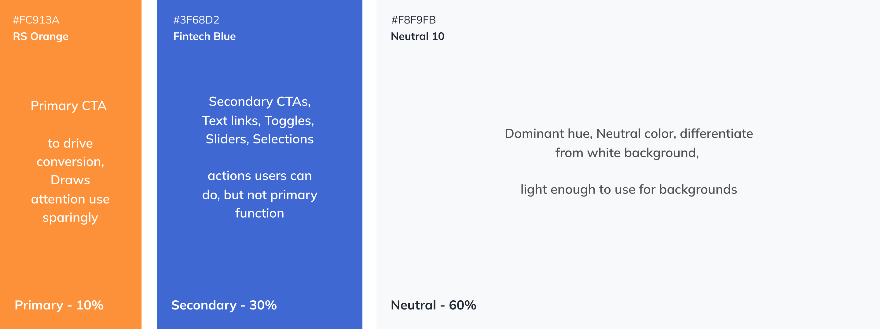
With Roofstock’s primary brand color and Fintech blue, I referenced the ‘60–30–10’ formula to create a sense of balance across the product. This technique came from the interior design — it’s often applied for house decorating. By following this rule, you’ll have 60% of your dominant color, 30% for your secondary color and 10% for accent color.
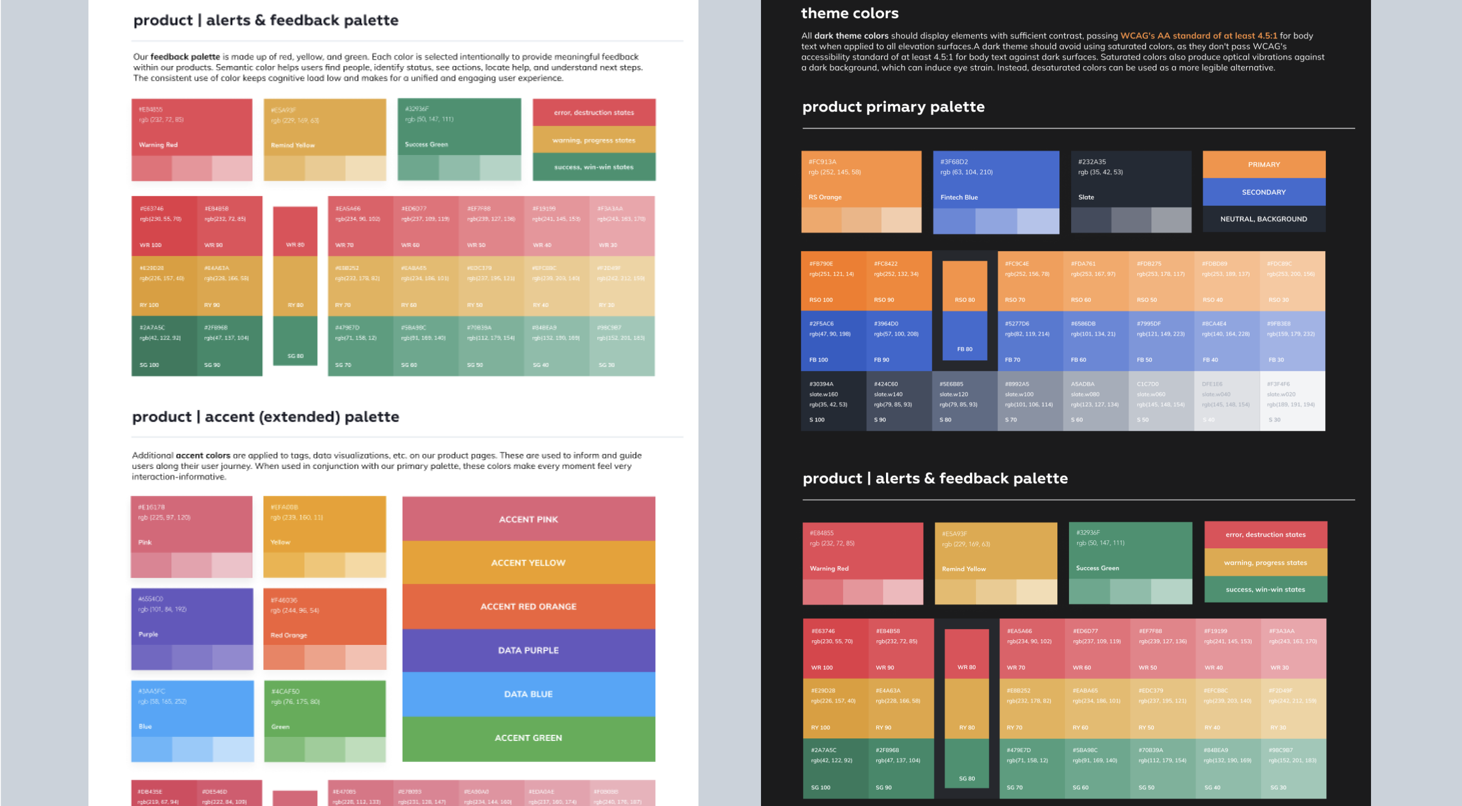
In addition, I applied the UI colors based on dark mode. All dark theme colors should display elements with sufficient contrast, passing WCAG's AA standard of at least 4.5:1 for body text when applied to all elevation surfaces. A dark theme should avoid using saturated colors, as they don't pass WCAG's accessibility standard of at least 4.5:1 for body text against dark surfaces. Saturated colors also produce optical vibrations against a dark background, which can induce eye strain. Instead, desaturated colors can be used as a more legible alternative.
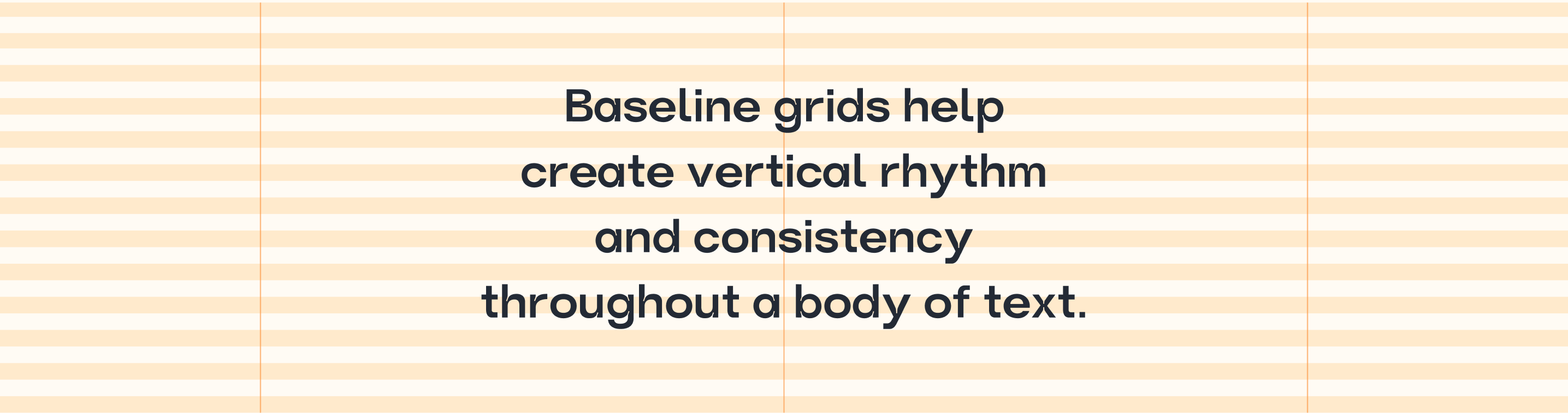
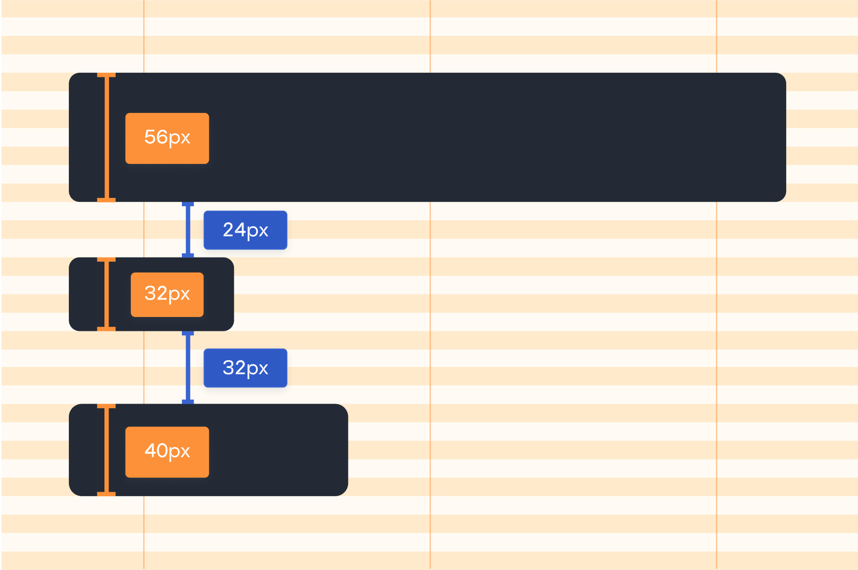
Baseline grid system
A major test to build successful components and UI screens is solidifying a grid system. I based the grid system on Google Material. Using a 8dp baseline grid across mobile, tablet, and desktop browser. Every UI element should be aligned to the 8dp grid in order to retain balance and proportion across the experience. Utilizing an even number like 8 creates efficiency and makes it easy for designers to make decisions while maintaining quality across an experience.
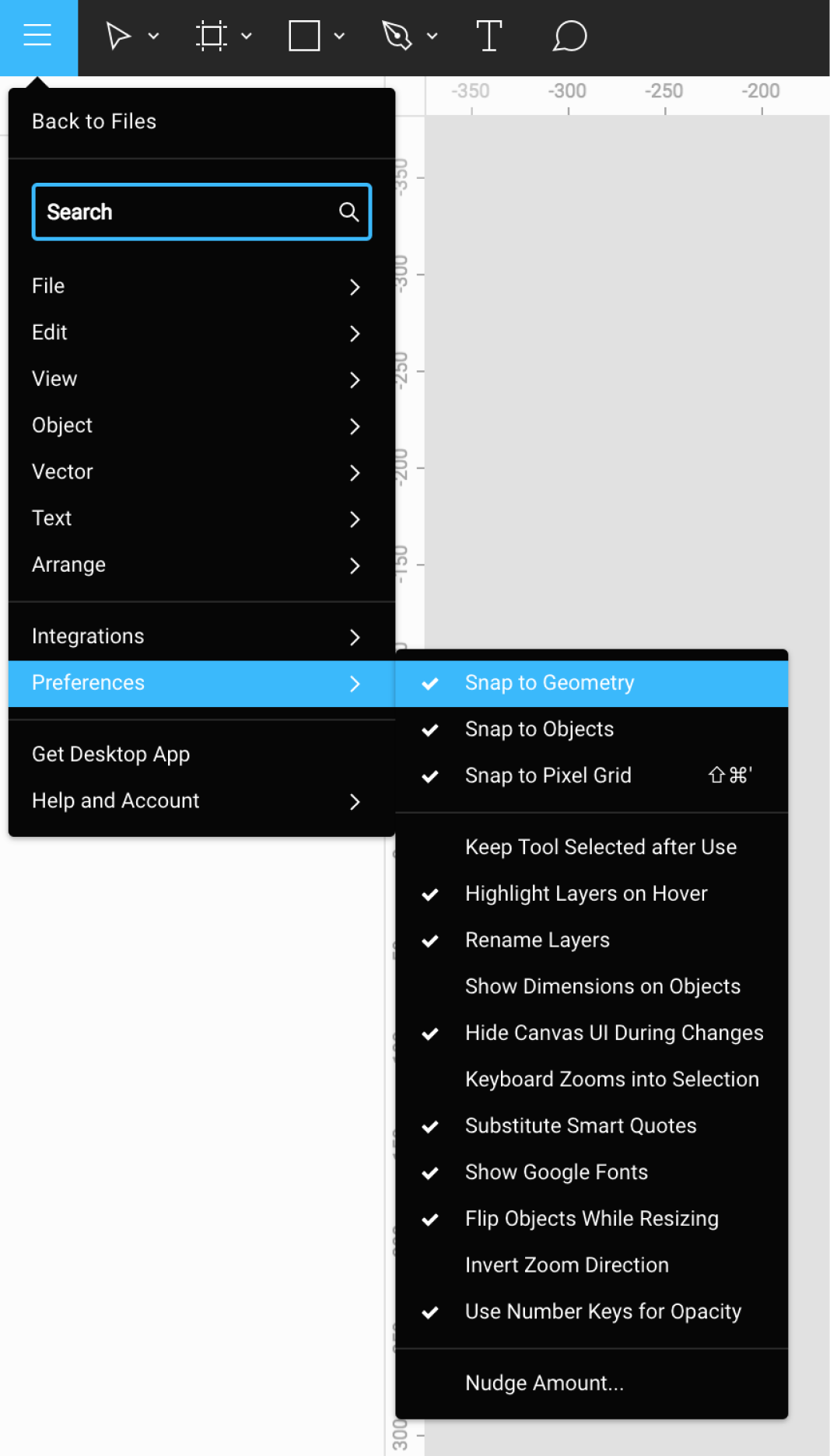
Nudge suggestions
Baseline text is important to achieve vertical consistency across different layouts. However, text sizes and line-heights don't always conform easily to the same UI grid as other elements might. If some text is not sitting on the baseline grid, it is okay as long as the text is positioned 8dp relative to other elements on the page.
I adjusted Roofstock’s "nudge amount" value in Figma default to 8dp.
Using type and color “tokens” to create components
Leading up to this redesign, our team has worked with creating design tokens. This proved to be a pivotal part of creating accessible components. The new component audits and the token structure workshops resulted in accelerating the updated brand style guide.
Roofstock Global Design System


Takeaways
A design system is a continuous project
A design system is never finished, it is a design system team effort to constantly improve projects, all while providing valuable and trustworthy products to the users.
Listen to people
There are a lot of business goals and roadmaps across XFN teams, which in turn can take the organization in different directions. Therefore, it is imperative to listen to the needs of all while creating a design system that fits all.
A design system is a scalable product
A successful design system is created with collaboration, especially designing tokens. The relationship between product and system designs is symbiotic, and rely heavily on one another.
 Ting Chang ©️ 2023 | Last updated: March 2023