Visual Interface Designer
Snapchat (via Aquent Studios)
instant messaging camera app
June .22 — September .22
Duration: 3 months
San Francisco, CA
Tools: Figma, Zero Height
Team: Systems Design Lead,
Accessibility Engineers
The Need for SIG Documentation
Snapchat’s mobile design system, Snapchat Interface Guidelines (SIG), started with engineers across Snap in 2019 contributing commonly shared components, solving handoff process. Today, SIG streamlines collaboration between designers and developers, all while helping teams build innovative products. SIG was in need for a design system documentation as a valuable resource to educate design teams to combine and present usage guidelines.
As a SIG designer, I wanted to supplement cross-functional teams with usage guidelines & support tools of Snapchat’s mobile design system.
The Need for SIG Documentation
There are two different needs that the design team are supporting in #sig-team: maintenance & expansion. The following priorities that fall under “maintenance” include:
● Educating feature product designers and engineers with support tools, how to use files in SIG's component library, and how it can be beneficial to their product.
● Creating a functional and working product, for a product (Snapchat App).
● Inform & expand usage guidelines.
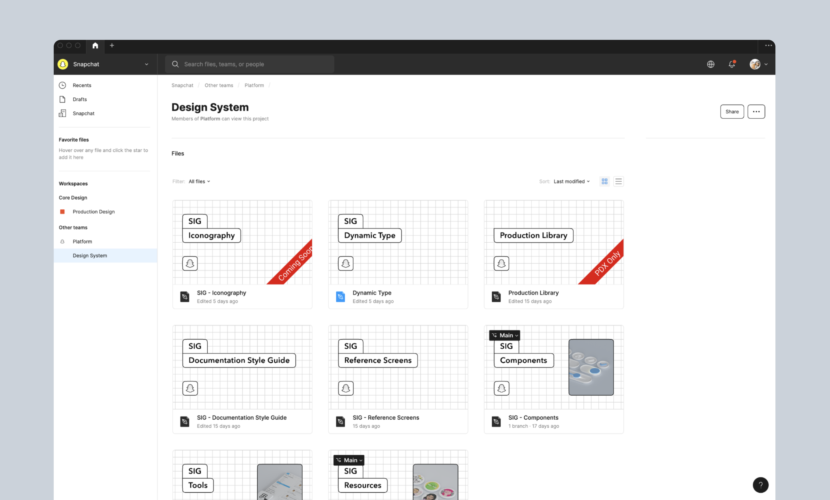
Current portfolio
Currently, SIG resource library supports a range of files. The most used file that feature teams rely on are: components & reference screens.
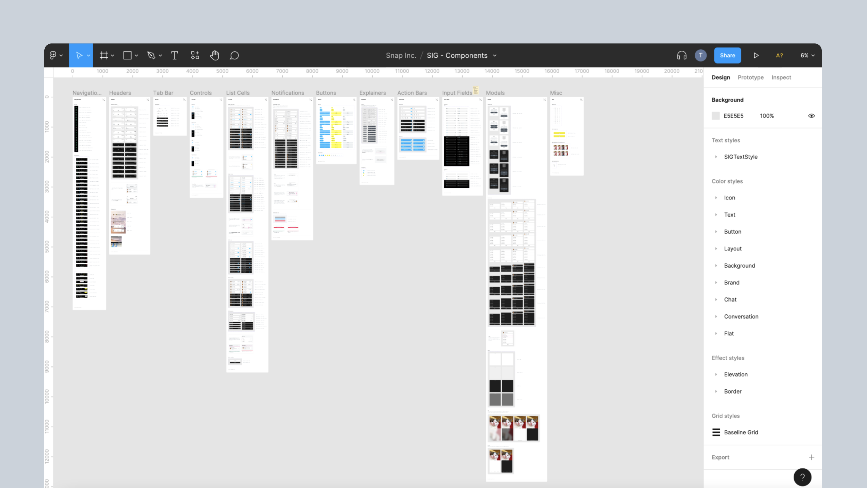
5 primitives — color, type, spacing, etc.
52 Components — (building blocks
3 platforms — iOS, Android, & Composer
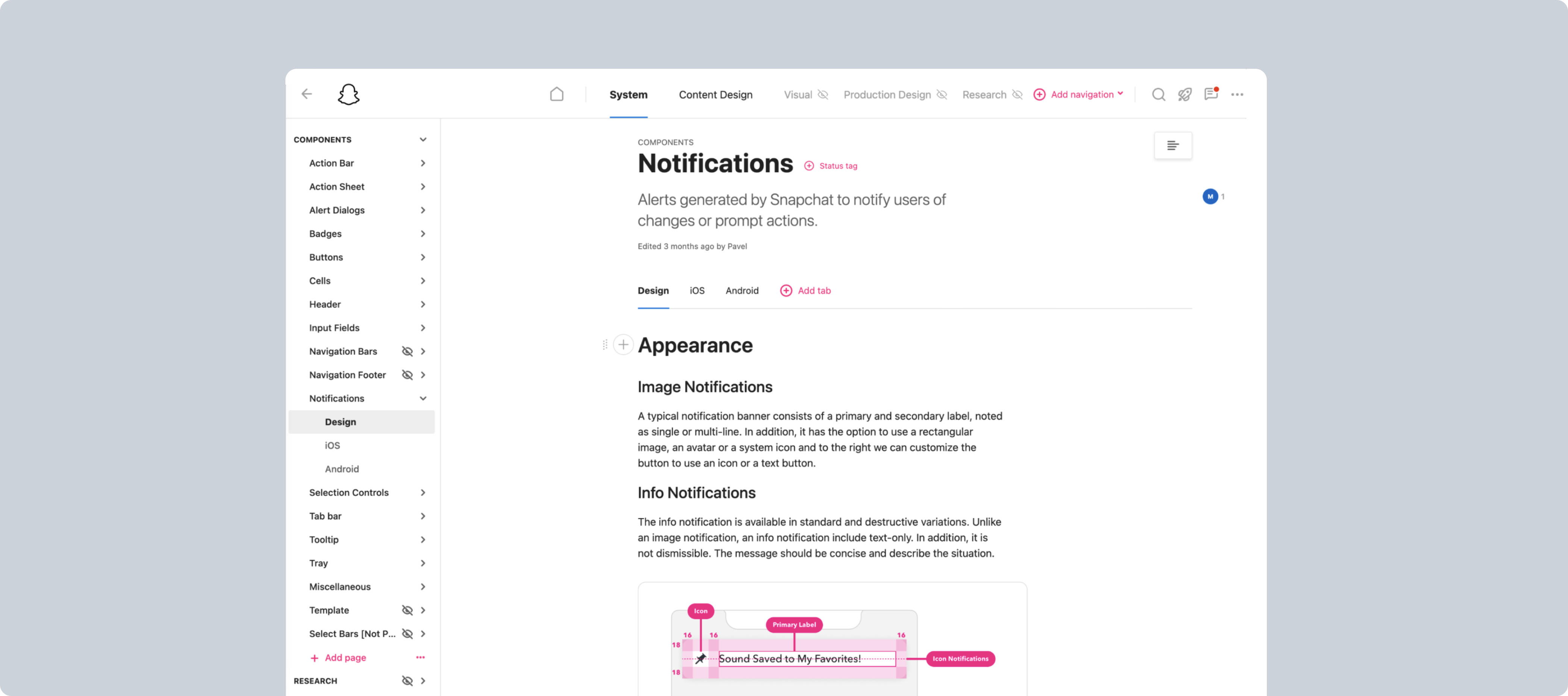
Resources —zero height documentation site
The SIG component library contain all the resources that we use. Paired with Zero Height documentation, it will be a tremendous resource for designers. A great example is having them understand which components have limitations, variations, etc.
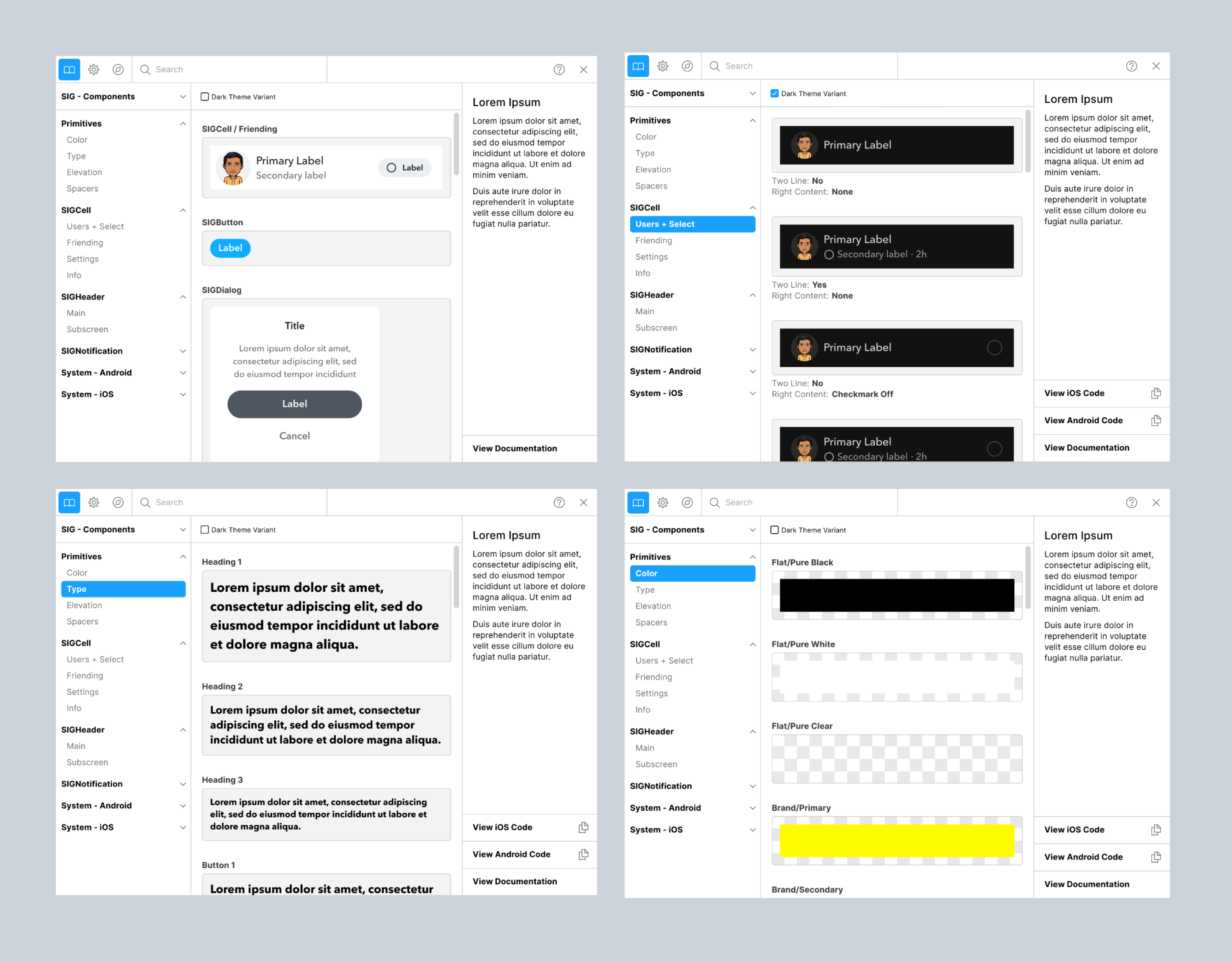
Figma plugin
While documenting, the #sig-team created a Figma plugin, which allowed designers to implement components, primitives, & colors in their designs when enabled.
The plugin offers a live, real time search for SIG components, as well as drag & drop. This helps to convey what is available, all while giving designers correct guidance on using components.
Documentation Process
Instruction examples of “Usage Guidelines”:
● When to use different switch controls (switch is immediate, used in a settings cell)
● How text will behave on longer strings (such as what happens when text overflows)
● Localization (how does RTL change the position of the switch, and how does the component change when reversed)

Takeaways
Be on the same page of the documentation process
There will always be friction to parallel updates on both designers & engineers source documentation. This leads to the importance of communicating updates between both teams.
Documentation adds dimensionality to design systems
Creating a design system doesn’t just end there, documenting it as a product for your feature teams is also as important.
 Ting Chang ©️ 2023 | Last updated: March 2023